 It’s a thrill to shop for furniture, but it’s a different story arranging them in the space. It looks fun in renovation shows, but when you’re looking at the real thing already — the empty and bare space, it’s hard to imagine where the sofa should go or where it should even face. If you’re planning to decorate your home by yourself, with no help from an interior designer, know first the basics of furniture placement before you take it on. Here’s what you should remember:
Point of focus
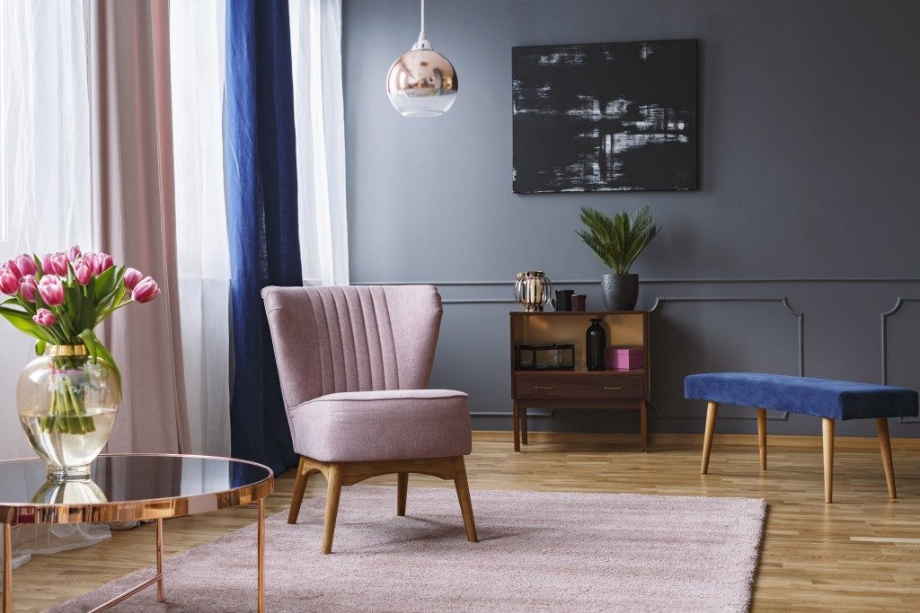
The basic layout of the space depends on your focal point. The focal point is like the star of the design, something that stands out from the rest of the elements. It’s what people should first see once they enter the space. Usually, the focal point is already built in the room. A fireplace, for instance, or a window with a great view. If you don’t have such, that’s the time to create your own.
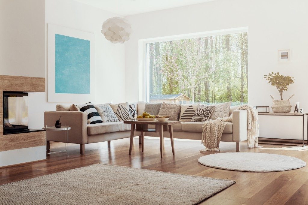
A common DIY focal point is a huge art piece hanged on the wall. Once you’re able to put up this focal point, it’s just a matter of piling on elements to it. Again, your goal is to make this feature the highlight of the space. In this instance, you may tilt your sofas towards the art piece. Now it’s just a matter of putting the accents, throwing some pillows on the seating or filling up the coffee table with vases and books. Again, the key is in identifying your focal point. From there, build the design.
Balance in look
It’s also important to consider striking a balance when it comes to mixing and matching pieces. You don’t want all the huge furnishings to be on one corner only. The same is true for the tiny elements. You’ll be able to achieve balance easily when you’re thinking symmetry: mirroring elements on each side.
A large sofa on one side of the fireplace? Add the same on the other. Three tiny pillows sitting on one sofa? Include the same on the other. To avoid looking like the space is too ‘neat’ or ‘staged’ because of perfect symmetry, add variety on the shapes. For instance, if you have linear lounge chairs and straight-patterned hardwood flooring, Orange County and other CA interior designers recommend going for a round coffee table or circular ottomans.
Space from walls

People who decorate their homes for the first time make the common mistake of pushing furniture, especially seating furniture, against the walls. It’s somewhat instinctive to follow the walls and line them up with stuff. It also seems to make sense if you only have a small room.
Here’s why it’s wrong: It usually ends up having a big dead space at the center of the room, making it look like it’s boring and unfinished. What you should do instead is to leave a good space, even small, from the walls. A small room will still benefit in this furniture placement because it creates a sense of intimate gathering. Just make sure that there’s enough pathways from the furniture. You don’t want the area to be cramped just because you moved away from the walls. Try to move around the area and see if you can freely stand, sit, and walk around.
You’re going to do great in your first decorating project — just remember these design concepts: emphasis, balance, and negative space. You will never go wrong with these. All the best in your design!

